If the neon sign above your physical showroom burned out, or if your front doors were jammed shut on a busy Saturday afternoon, you wouldn’t wait a month to fix it. You would have a repair crew on-site within the hour. You know that a broken physical storefront kills foot traffic instantly.
Yet, independent furniture retailers regularly allow their digital storefronts—the place where the vast majority of their customers first interact with their brand—to languish for years.
Your homepage is your new front door. If it is slow, confusing, or outdated, it doesn’t matter how beautiful your physical showroom is. The customer will simply click away to a competitor. It is time to determine if your website is an active digital showroom driving local foot traffic, or a digital graveyard where potential sales go to die.
Take out your smartphone right now, clear your browser cache, and perform this brutal 10-second audit.
The 10-Second Homepage Audit
You have exactly 10 seconds (often much less) to convince a first-time visitor that your store is worth their time. In that window, your homepage must flawlessly execute three things:
1 | Mobile Speed: Did the site load instantly, or did you stare at a white screen for four seconds while massive hero images struggled to render? A one-second delay in mobile load time can drop your conversions by up to 20%. If your site isn’t fast, your customer is already gone.
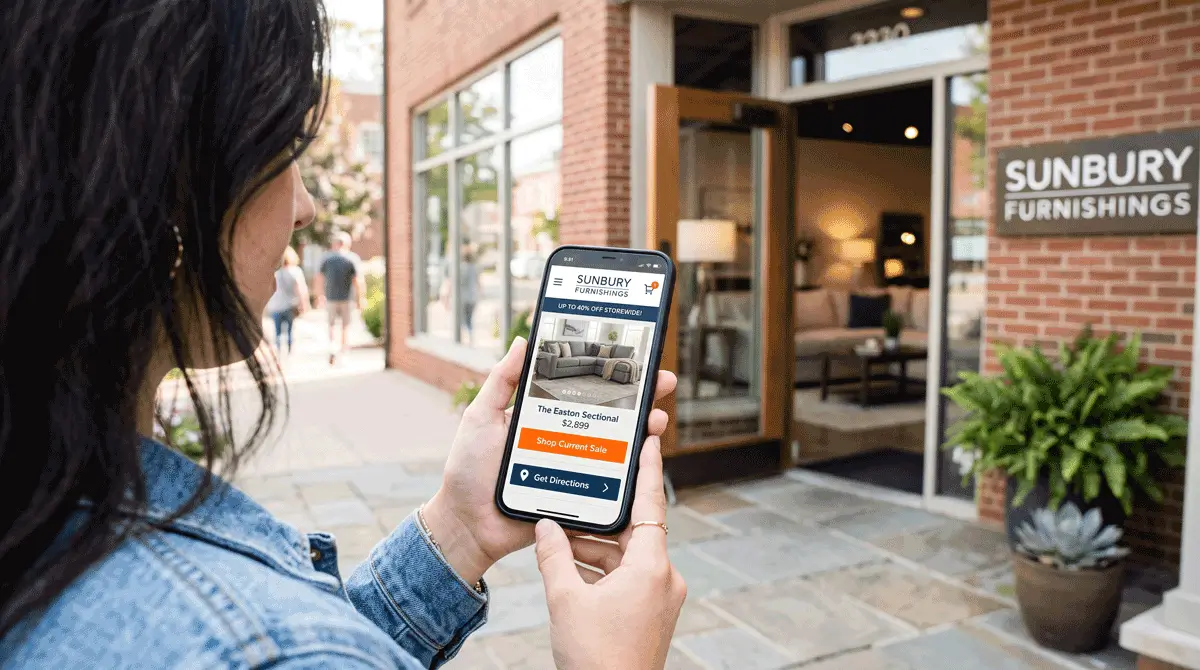
2 | Clear Call-to-Actions (CTAs): What exactly do you want the visitor to do? If your homepage is just a pretty picture of a living room with no direction, you are failing. Within three seconds of scrolling, the user should see clear, tappable buttons directing them to “Shop Sectionals,” “View Current Ad,” or “Get Directions.”
3 | Visible, Current Promotions: Does your homepage reflect your showroom floor right now? If it is mid-October and your homepage is still promoting a Labor Day sale, you are broadcasting that nobody is actively managing your store. Current financing offers, inventory clearances, and holiday events must be front and center.
If you failed any of those three checks, you are actively leaking revenue.
The Top 3 Mobile UX Mistakes Killing Your Conversions
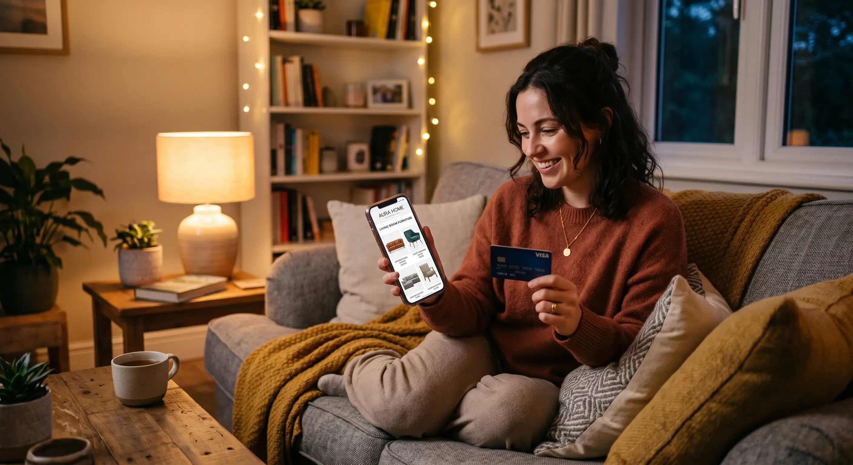
Over 60% of furniture shopping begins on a mobile device. Your customer is likely lounging on their current (uncomfortable) sofa, scrolling on their phone, deciding where to shop this weekend. If your mobile user experience (UX) is frustrating, they will cross you off their list.
Here are the three most common mobile UX mistakes independent retailers make:
1. The “Pinch-and-Zoom” Nightmare
If a customer has to pinch their screen to read the text on your current promotional banner, your site is not truly responsive. Many retailers upload desktop-formatted graphics directly to their mobile site. The text becomes illegible, and the buttons are impossible to tap. Mobile banners must be specifically designed for vertical, small-screen viewing with large, bold text.
2. Buried Store Locations and Hours
Remember the goal: Clicks to Bricks. The entire purpose of your website is to drive the customer into your physical store. If a mobile user has to hunt through a nested hamburger menu to find your address, store hours, or a phone number, you are creating unnecessary friction. Your location, a “Get Directions” link, and a clickable phone number should be anchored to the header or footer of your mobile site at all times.
3. Non-Tap-Friendly Navigation
“Fat-finger syndrome” is real. If your mobile drop-down menus feature tiny text links clustered tightly together, users will inevitably click the wrong category, get frustrated, and leave. Your mobile navigation needs large, distinct touch targets. If a user clicks “Living Room,” they should be presented with a clean, spacious grid of sub-categories (Sofas, Recliners, Tables) that are effortless to tap.
Your digital storefront requires the exact same level of daily care, merchandising, and attention as your physical showroom floor. You wouldn’t tolerate a messy, confusing, poorly lit physical store. Stop tolerating it online. Run the 10-second test, fix the friction points, and turn your website back into the lead-generating machine it was meant to be.
Since 1984, R&A Marketing has built digital storefronts that actually perform. If your homepage failed the 10-second test and you need a website built specifically for the demands of the home furnishings retail space, we can help. Let’s Talk >